5 E-commerce Design Mistakes That Kill Sales
Common UI/UX pitfalls and how to fix them for higher conversions
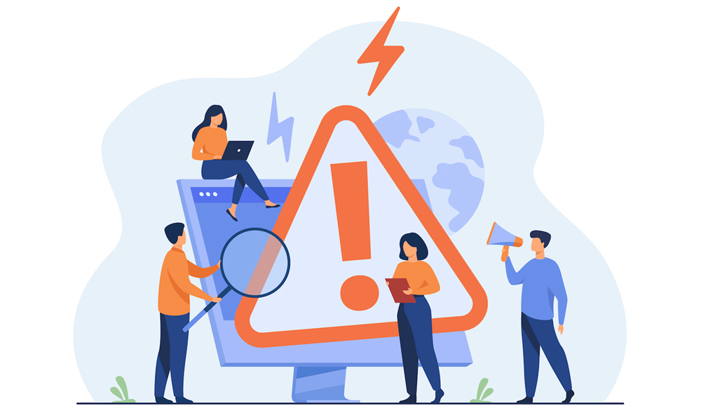
Design is more than aesthetics—it’s the bridge between a visitor and a purchase. Yet many e-commerce websites make avoidable UI/UX mistakes that frustrate users, reduce trust, and drive potential buyers away. In this article, we’ll highlight five of the most damaging design mistakes in e-commerce and explain how to fix them to maximize conversions and sales.
Shoppers should find products in seconds, not minutes. Complex menus, unclear categories, and hidden filters cause frustration and increase bounce rates.
Fix: Use clear categories, add a visible search bar, and implement faceted navigation (filters for price, size, color). On mobile, use collapsible menus with sticky headers for easy browsing.
Example: A fashion store simplified its mega menu and added predictive search. Result: product discovery improved, and conversions rose by 18%.
CTAs like “Add to Cart” or “Checkout” should be instantly visible. Poor contrast, small button sizes, or burying them below the fold reduces clicks and sales.
Fix: Use bold, contrasting colors for CTAs. Place them above the fold and repeat strategically throughout the page. Ensure buttons are thumb-friendly on mobile.
Case Study: An electronics retailer increased conversions by 27% after redesigning its CTA buttons with stronger contrast and larger sizes.
With over 60% of sales happening on smartphones, a clunky mobile site is a conversion killer. Tiny text, difficult forms, and slow load times cause users to abandon carts instantly.
Fix: Implement responsive design, larger tap targets, and streamlined one-page checkouts. Optimize Core Web Vitals specifically for mobile users.
Example: A furniture retailer improved its mobile checkout by integrating Apple Pay and Google Pay. Mobile sales jumped 22% in 30 days.
Without trust, there are no sales. Missing reviews, unclear return policies, or lack of security badges create doubt in buyers’ minds.
Fix: Add product reviews, star ratings, SSL badges, and transparent return/refund policies. Display trust badges near CTAs, not buried in the footer.
Case Study: An online supplement store increased conversions by 19% after prominently displaying customer reviews and money-back guarantees.
Too many competing visuals, pop-ups, and banners overwhelm users. Instead of guiding them, you distract them, which reduces focus on key conversion elements.
Fix: Embrace minimalism. Use white space strategically, highlight one primary CTA per page, and reduce unnecessary distractions. Focus on a clean hierarchy of product images, descriptions, and checkout buttons.
Example: A subscription box service reduced homepage clutter by removing rotating banners and focusing on a single hero offer. Conversions increased by 25%.
One of the biggest silent killers is a complicated checkout. Multiple steps, forced account creation, or hidden fees cause cart abandonment rates to skyrocket.
Fix: Offer guest checkout, minimize form fields, and be transparent about pricing. Show progress indicators to reassure users about how close they are to completion.
- ✅ Simplify navigation for fast product discovery.
- ✅ Design bold, visible, mobile-friendly CTAs.
- ✅ Audit mobile performance and streamline checkout flows.
- ✅ Add visible trust signals (reviews, guarantees, security badges).
- ✅ Reduce clutter and prioritize key conversion paths.
- ✅ Optimize checkout for speed and transparency.
Even small design flaws can have a huge impact on conversions. By addressing navigation, CTAs, mobile experience, trust, and layout, you can remove friction and create a seamless path to purchase. In competitive e-commerce markets, fixing these mistakes is one of the fastest ways to unlock sales growth without spending more on ads.
Design optimization doesn’t have to be guesswork. SalesPilot is an advanced seo extension that helps you identify weak spots in UI/UX, Core Web Vitals, and conversion paths. With AI-powered recommendations, you can fix mistakes faster and watch your sales grow.
Free Chrome extension • UI/UX analysis • Fix mistakes, increase sales